Stock charts are a visual representation that helps traders make informed choices. A study by the CFA Institute found that 84% of successful traders rely on technical analysis. chart patterns are one of the most important tools. Over 70% of retail investors said that they rely on chart patterns to forecast market trends in 2022.
This blog
will prove that stock charts can improve your trading strategy and increase your chances of succeeding in a competitive market.

Choose the Right Type of Chart
Traders commonly use several types of stock charts. Each chart gives you a unique perspective on the stock price:
Line Chart: This simple chart shows a stock’s closing price over time. This chart is great for spotting trends but doesn’t provide much information about the daily price movement.
Bar Chart: Shows the open, close, highest and lowest prices of the stock for each period (days, weeks, months). This chart shows how a stock’s price fluctuated over some time.
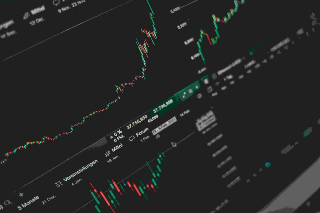
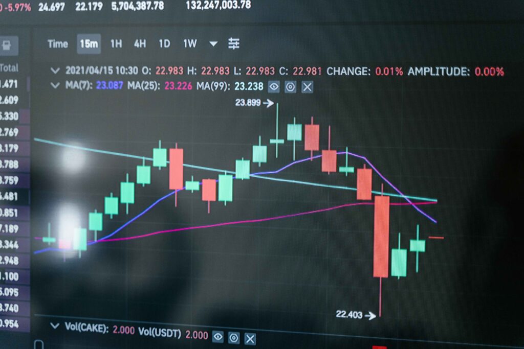
Candlestick Charts: These chart patterns are viral among traders. Each “candle”, which represents the high, low, open, and close prices over a certain period, is colored according to whether the price has gone up or down.
Understand the Axes
Horizontal Axis: This represents the time. The more recent the data, the farther you move to the right. This can be set to display data for different periods, such as days, weeks or months.
Vertical Axis: This shows stock prices. The higher you go up, the more expensive the stock.
Identify Trends
The key to reading stock charts well is to look for trends.
Uptrend: When the price rises steadily over time with higher highs and higher lows. This means that the stock’s value is increasing.
Downtrend: A price falling consistently, with lower lows and higher highs. This means the stock has lost value.
Sideways (Flat Trend): The price does not show a clear trend and remains relatively flat. This indicates that the stock has not moved much upwards or downwards.
On stock charts, trend lines are drawn to emphasize these trends. In an upward trend, a line that slopes up connects lows. In a downward trend, a line that slopes down connects highs.
Candlestick chart Patterns
If you use a candlestick graph, you can also identify specific patterns that can give you an idea of the price movement in the future. Here are a couple of basic ones.
Bullish Patterns are a sign that the market is likely to rise. In the case of a “hammer”, the pattern shows the price recovering after a day-long drop. This could be a sign of pressure from buyers.
Bearish Patterns: They indicate a possible price fall. A “shooting star” pattern is when the price spikes but drops again by the following day. This indicates selling pressure.
Use Indicators
Technical indicators can be used to interpret chart data better. Some of the more common indicators include:
Moving Averages: These smoothen out price data, allowing you to see the average prices over a given period (e.g. moving average of 50 days). Moving averages indicate an uptrend when they are rising, and a moving average falling indicates a downtrend.
Relative Strength Index RSI: This was discussed earlier. It can help you decide whether to buy a stock or sell it.
Look at Volume
Volume is the total number of shares traded on a particular stock over time. The bar is displayed below the chart.
High volume: When the volume and price of the stock are high, this indicates strong demand. The uptrend may continue.
Low volume: When the price rises, but the volume is low, it is possible that the trend will not last, as there may not be enough buyers to push the price higher.
Time Frames Matter
When you read charts, consider the time frame. When you zoom out, the chart may show that an asset has been in a positive trend for the last week. But if you look at it over a month, or even more, it could tell a very different story.
You can choose between different timeframes (daily or weekly) to better understand the overall trend.
Spotting Support and Resistance Levels
Support: This price level is where the stock stops falling and rises again. Traders see this as a good opportunity to buy. You can think of it as “the floor” for the stock price.
Resistance: This is the opposite price level, where stocks tend to stop growing and could start falling. It’s like a “ceiling”.
When a stock breaches a resistance or a support level, this could indicate a greater price move to come.
Putting It All Together
Start by identifying the general trend when you are looking at a chart. The price is moving up or down. Is it sideways? Check for candlestick patterns and other indicators such as moving averages, RSI and volume. These will give you more insight into the direction of the trend.
It may take a little practice to read charts, but when you master the basics, they can be a very powerful tool for making better trading decisions.
Chart patterns are a great way to make informed decisions rather than guesswork.
Follow these steps to read stock charts confidently. This will help you stay on top of the market and have a better time for your trades.


